3 minute read / Nov 12, 2013 /
Why the Petal Diagram Isn't the Best Competition Diagram for Startup's Pitch
Steven Blank wrote yesterday about a novel way of depicting a startup’s competitive landscape in a pitch deck, called a petal diagram. While the petal diagram is a great way of describing an ecosystem or a go-to-market strategy, I don’t think it’s a great way to show a competitive landscape because petal diagrams don’t communicate the startup’s unique way of competing in the market.
The ideal competition slide accomplishes at least one but up to four goals. First, the competition slide communicates the startup’s worldview of their ecosystem, relays the key axes of differentiation in the market and summarizes the startup’s advantages. Second, the competition slide demarcates the other key players in the ecosystem, established and emerging, and how each of them fit within the worldview. Third, the slide conveys the dynamics within the ecosystem: who is partnered with whom; which incumbents are looking to partner/acquire vs go it alone, etc. Fourth, the competition slide should shows the current market opportunity and if needed adjacent market opportunities that justify a venture scale outcome.
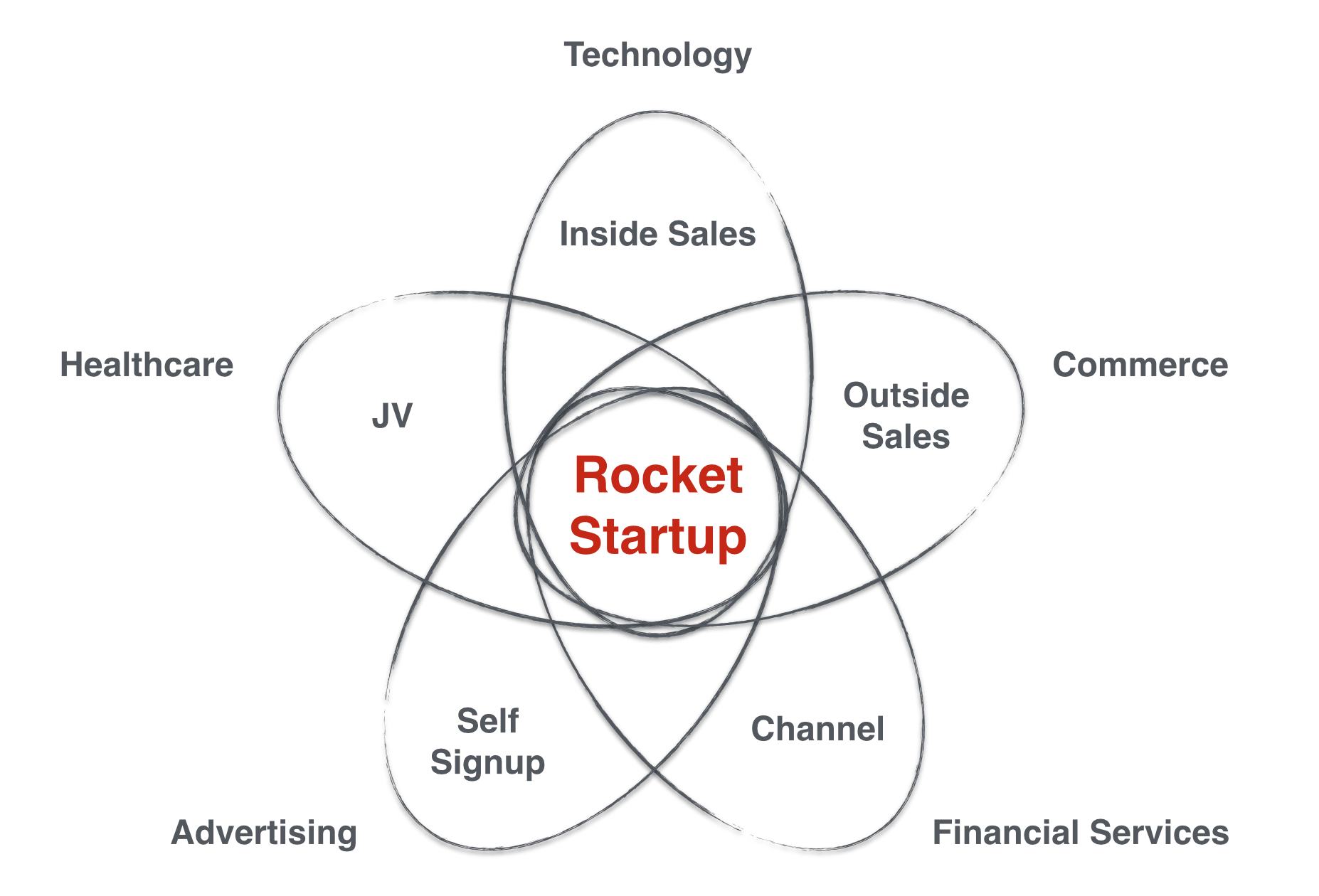
The petal diagram can effectively communicate the players in the ecosystem and describe how a startup will engage with an ecosystem through customer acquisition channels. In the fictitious Rocket Startup example above, the petal diagram shows all the different customers segments the Rocket might pursue, which could be filled with customers logos, and the sales mechanisms the company might use to acquire those customers.
But a petal diagram is a very difficult format to convey Rocket’s differentiation in the market required to win share. I’m not sure how to do it. Tweet me if you have ideas. Even for a company in a new segment, like internet of things or drones, it’s unclear how to express differentiation with the petal diagram.
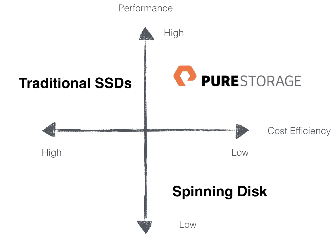
There’s a reason the 2x2 matrix is cliche - it works for well understood industries where the size and segments of the market are understood and the typical disruptive innovation is a price/performance breakthrough, like this one for Pure Storage.
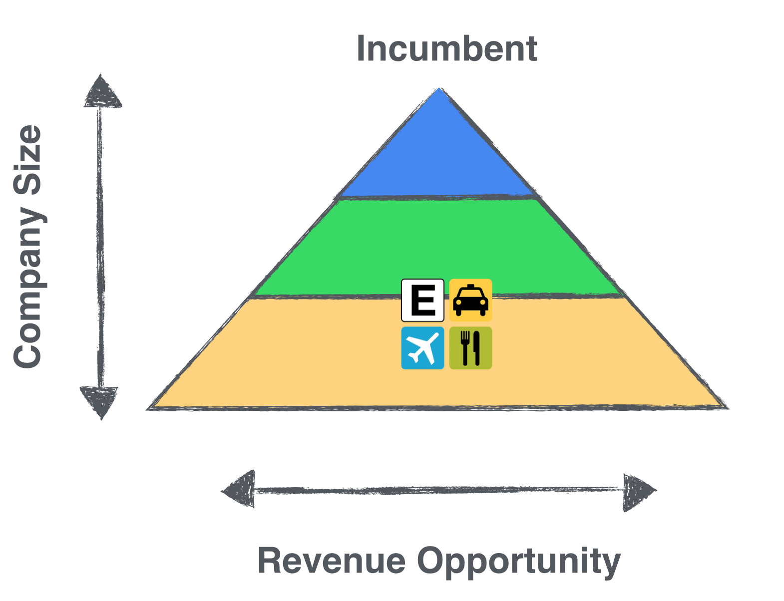 Another alternative is a pyramid which expresses a startups intent to disrupt a market by addressing a new segment, as in this example for Expensify.
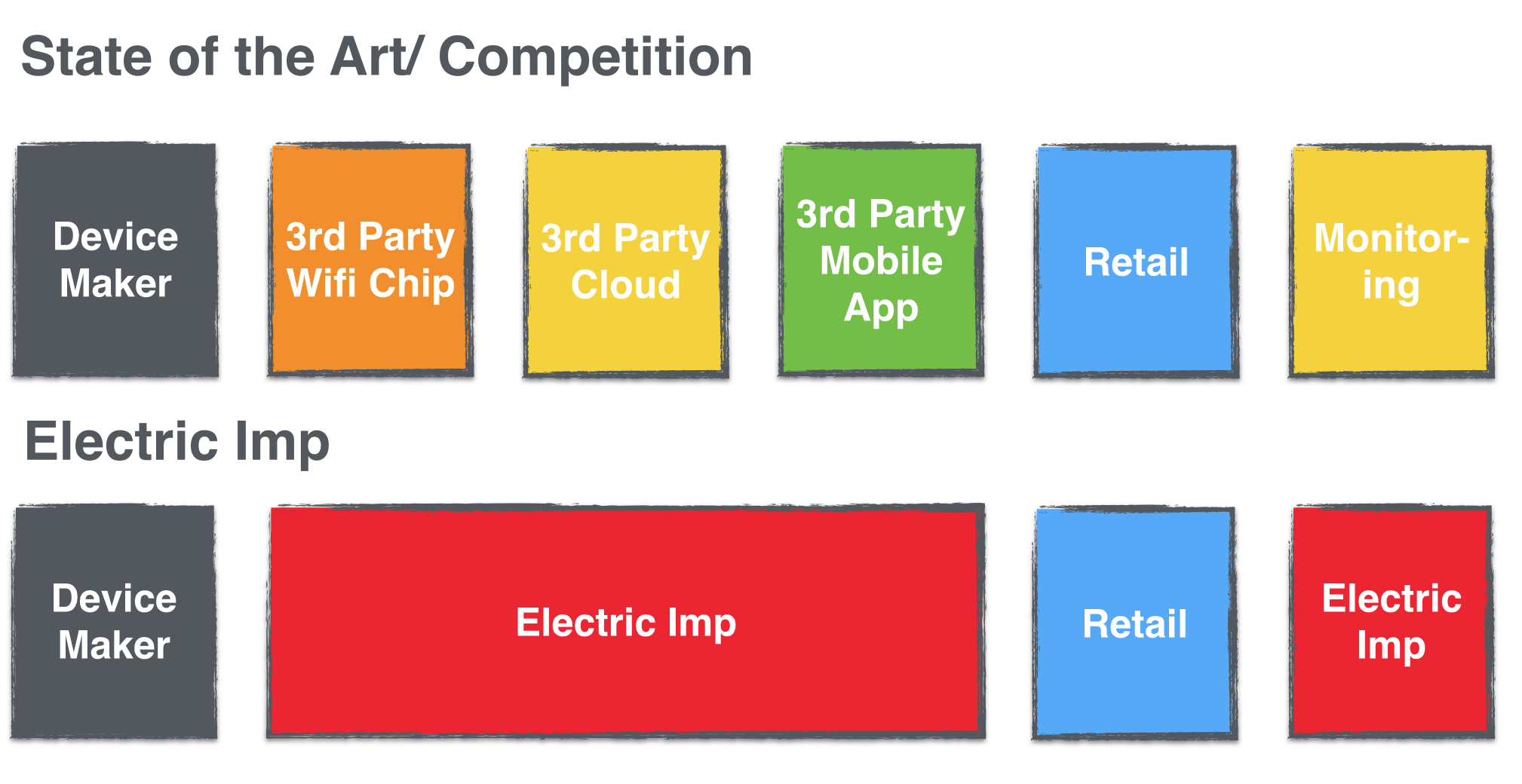 Value chains can also be used to express disruption by vertical integration or disintermediation. In this case, the diagram highlights Electric Imp’s vertical integration in the connected devices world.
There are many ways to create a competition slide. No matter the format, the structure of the slide has to reinforce and support the main message, which in the case of competition slides, is why the startup is best positioned to win disproportionate share. The petal diagram is a useful tool for depicting go-to-market and ecosystem slides where channels and partners are important, but because of the difficulty in expressing differentiation, I wonder about its effectiveness as a competitive overview format.