Predictability is sexy. Startups that have tuned their growth engines well enough to accurately forecast their growth, presuming these growth rates are attractive, will command much higher valuations in the market, simply because there is less risk in the company. As a result, investors prize these companies disproportionately.
The challenge with predictability is predictability isn’t an end state. A business doesn’t become predictable one day and remain in that state in perpetuity. Rather, predictability is a discipline that must be practiced by managers and management teams within startups.
Further complicating things, predictability is a product of many different teams’ efforts. Engineering and product teams set goals and deliver products on time. Marketing teams seek to generate sufficient marketing qualified leads (MQLs) to enable sales teams to achieve their sales quotas. Human resources must create a process to hire the right people when the business needs them.
As Peter Drucker said, “you can’t manage what you can’t measure.” The same is true for predictability.
Andy Grove, the former President of Intel, and author of one of my favorite management books, wrote about a technique for measuring predictability in his book, High Output Management, called the Stagger Chart.
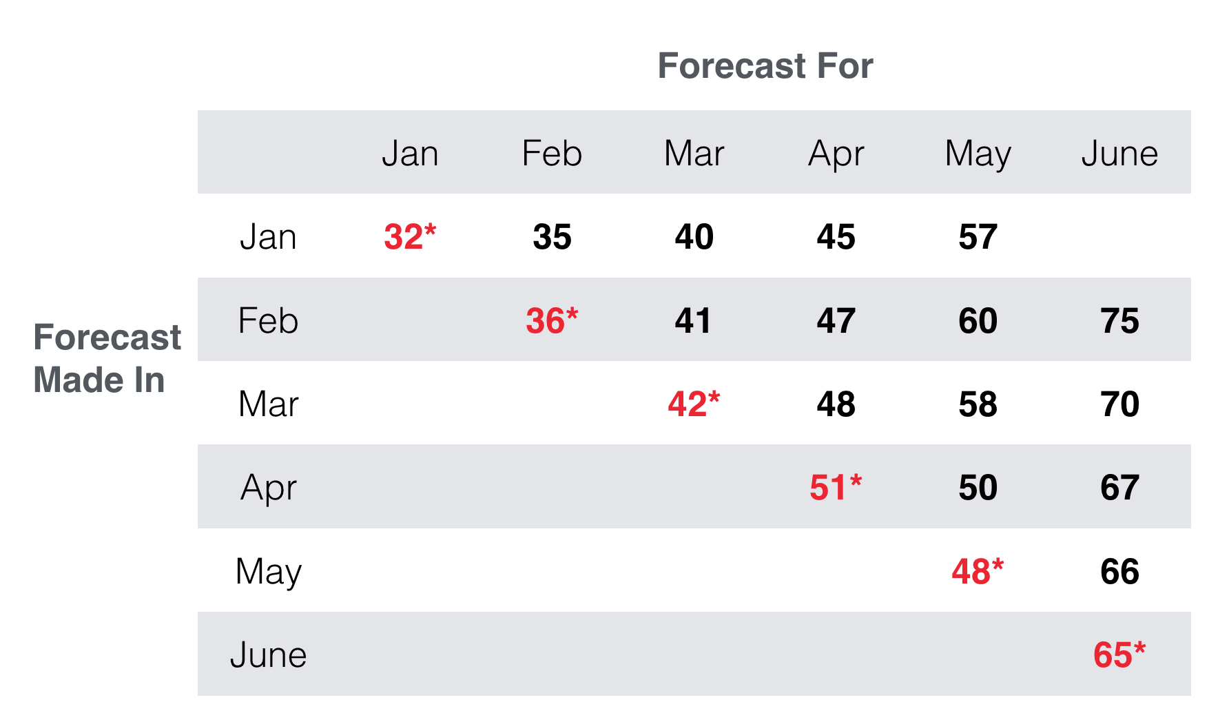
I’ve produced a hypothetical stagger chart for a fictional SaaS company’s revenue above. Along the horizontal axis is the forecast for each month. Along the vertical axis, are the months in which a forecast was made.
Making this a bit more tangible, the second line, the February line with the numbers 36*, 41, 47, 60 and 75 is the four month forecast made in February. In February, the company generated $36k in revenue and the management team predicted $41k in March revenue, $47M in April revenue and so on.
This chart tells the reader three things:
- The actual revenue growth for the business. The numbers in red with asterisks are actual figures.
- Looking down a column tells the reader how the forecasts for a particular month have changed with time. For example, March’s forecasts became stronger with time. June, on the other hand, fell with time.
- When the forecasts fall out of line, as they have in June, something is wrong or some key expectation hasn’t borne out, and the team should investigate the cause for the deviation.
These types of charts can be applied to most activities of a startup including sales dollars, new customers, marketing leads, hires, churn….the list goes on.
By asking for predictions and then retrospectively evaluating the predictions and how they change with time, management can ingrain more predictability into the business, and also develop a toolkit to find some of the leading indicators of changes within the business.