After I wrote a post on six important cohort reports, I received a handful of questions about how to interpret cohort charts effectively. When I review cohort data from companies I work with, I look into three different trends to evaluate a product’s performance.
This is a cohort chart of hypothetical product indicating percentage of monthly active users each week for 12 weeks. There’s great data here and but the amount of data can be overwhelming. Time flows down and right in the chart below.
But if we simplify the analysis into three charts we can isolate three key trends that will indicate our product’s performance. These are the On Boarding Trend, the Longitudinal Trend and the Cohort Trend.
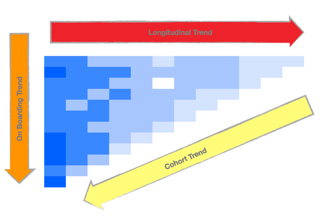
The On Boarding Trend, the orange left arrow, indicates the product’s effectiveness in its first month of use and its trend over time which is nothing less than a metric for user on boarding effectiveness. The first cell in each column indicates the monthly active rate for the cohort’s first month as users. In our hypothetical data set, that number grows varies from 35% to 41% over time. The product team has done a reasonable job of improving user on boarding and engaging users when they sign up.
The Longitudinal Trend, the top red arrow, indicates how the activity rate changes as users continue to use the product. The first row is the oldest cohort of users with the most recent data, the ones who signed up most recently. The bottom row is the newest cohort. Time flows right in this chart.
In our hypothetical data, there are two important conclusions. First, our user base becomes less active over time and over the past 12 weeks, we see the activity rate falling, indicating the product isn’t keeping the attention of its users. Second, the decay in user activity is relatively constant across all cohorts meaning the product improvements over the past 12 weeks haven’t made an impact.
The Cohort Trend, the bottom yellow arrow, indicates the current contribution to activity of each of the cohorts. In our hypothetical example, the older cohorts contribute 1/10th the activity of newer cohorts. This means user re-engagement through marketing or product efforts should be explored in addition to finding new ways to retain users.
Cohort analysis is quite useful because product teams can test different product features and measure the impact on a user base over time. Different on boarding flows will impact the on-boarding trend. New lifecycle features will alter the course of the Longitudinal Trend. Engagement tactics will change the cohort trends. Tying product changes to behavior informs great product design.
There are many more analyses that can be done using cohorts, but these are the three key analyses I use that are consistently useful to evaluate product performance.