When I was at Google, we worked with a user experience team frequently to help us design changes to the AdWords front end. After having reviewed our designs within our product team for weeks, we often thought the design was complete and foolproof. But we were consistently proven wrong by the UX team whose work surfaced face-slapping oversights.
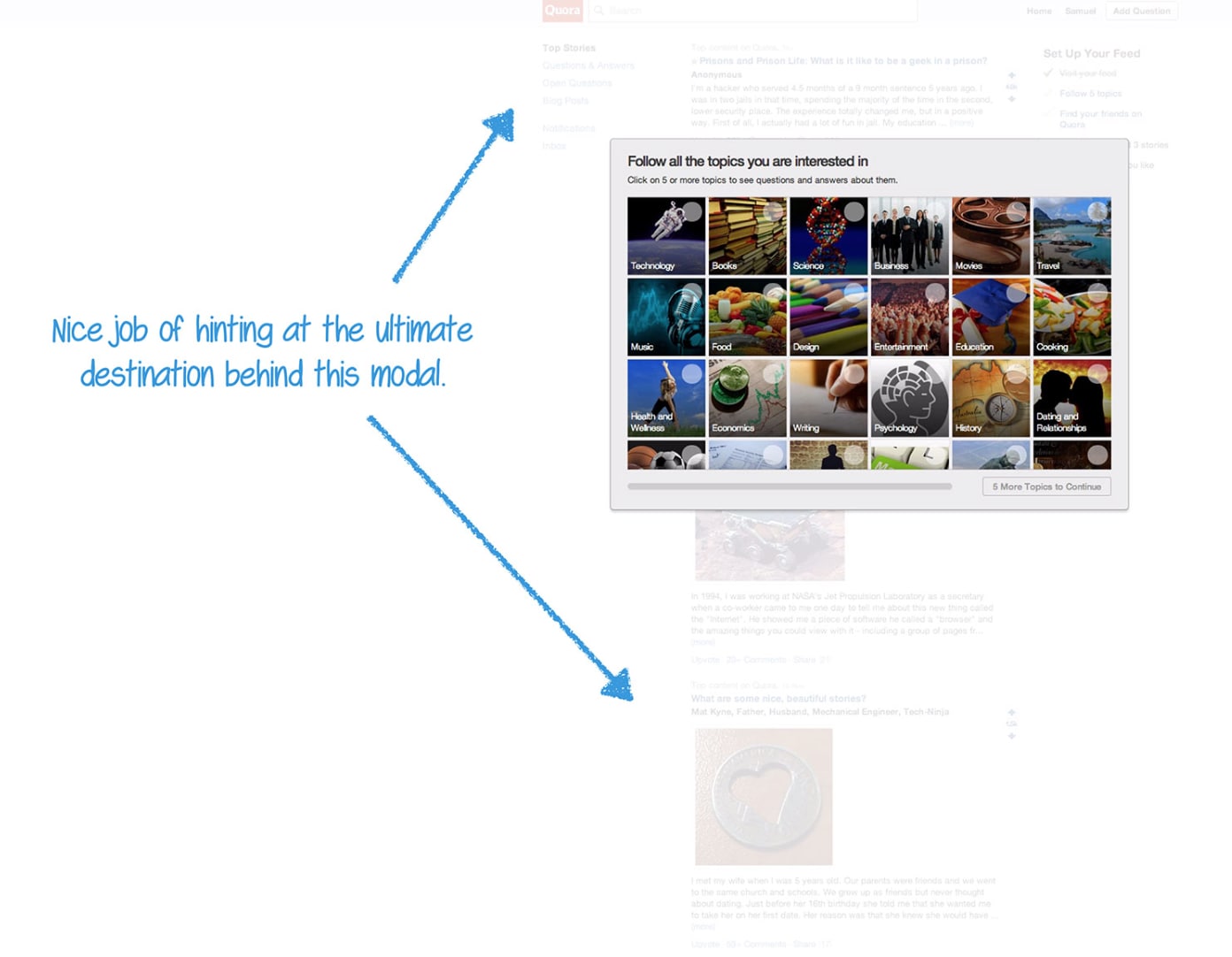
At UserOnboarding, Samuel Hulick has taken this approach with more than 40 different on-the-mark and a bit irreverent UX critiques of many top internet and mobile services.
Reading through the breakdowns reminded me of those UX sessions at Google and reaffirms the insight a fresh pair of eyes can offer when looking at a product. Samuel’s critiques also surface the positive practices of products like Slack which provides concise descriptions of each step, and clear calls to action.
Great design is opinionated design on the right assumptions to make and while we all may disagree on the best affordances to make for users, Samuel’s body of work provides one consistent view across many products to compare and contrast different approaches.
Most importantly, these breakdowns demonstrate the power of user experience research to catch the issues in product flow, user communication and clarity that can materially impact user conversion rates through funnels.
UserOnboard is a rich library of on-boarding approaches that should be in the library for product managers and designers everywhere.
