The Sales Motions of B2C2B Companies
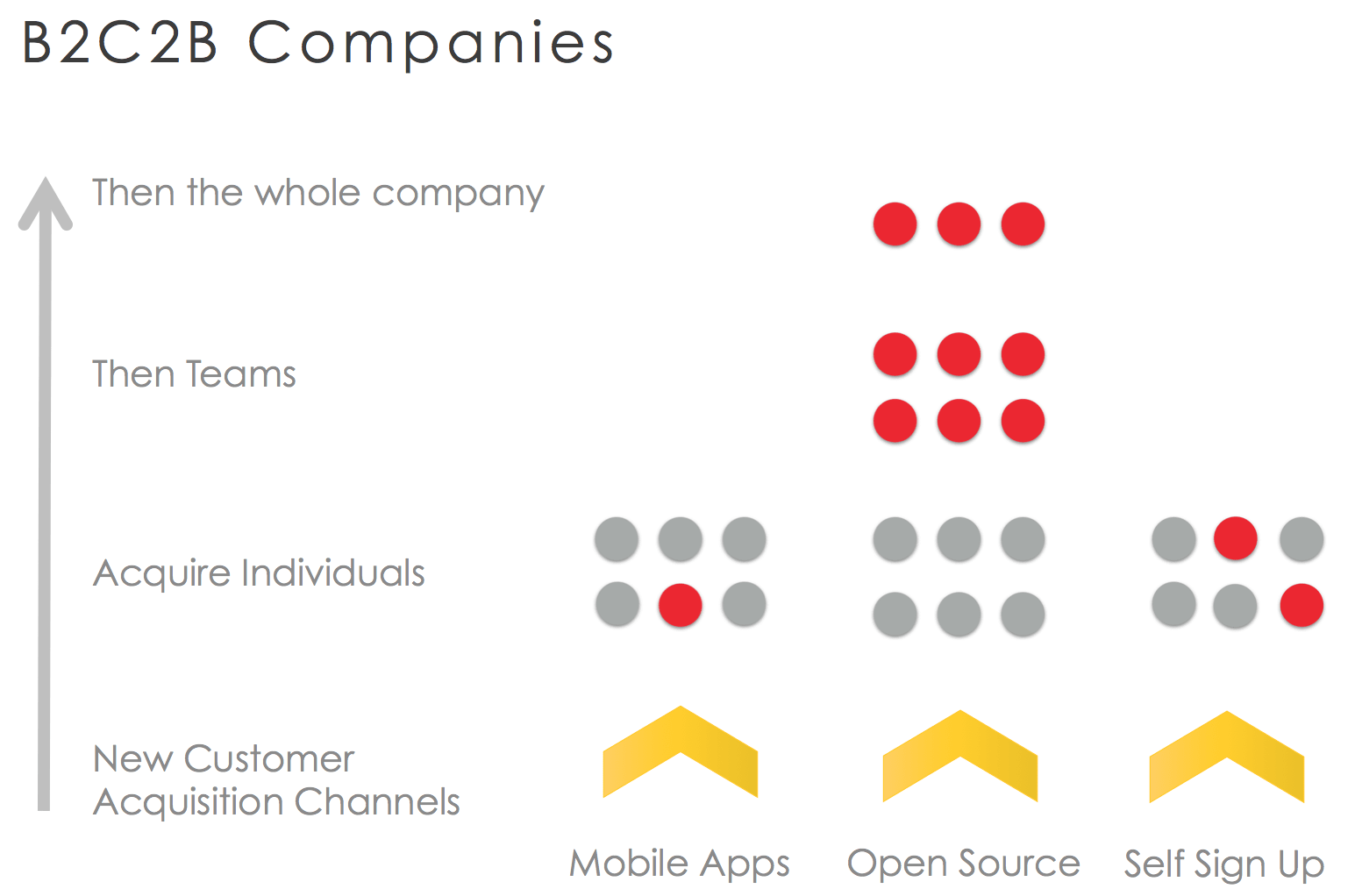
After writing about B2C2B companies last week, I received a lot of great comments about the differences between the B2C2B models, particularly the sales models after a company has acquired the initial Consumers.
These are three sales models I’ve observed B2C2B companies use to convert the initial momentum with consumers into dollars.
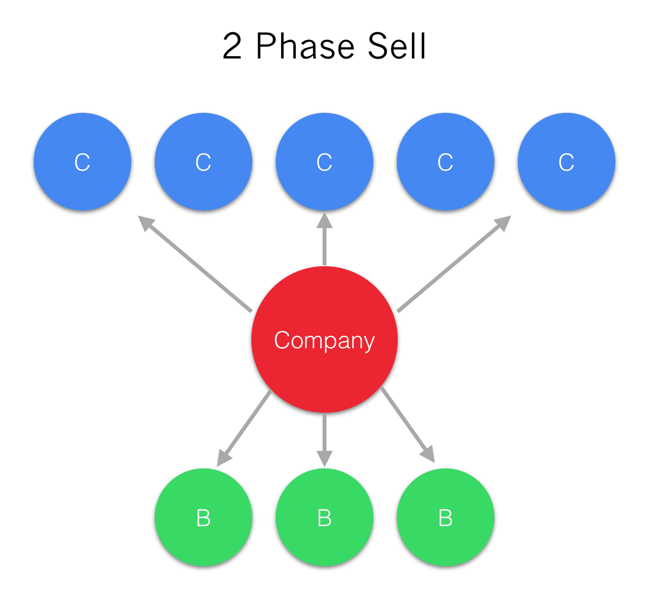
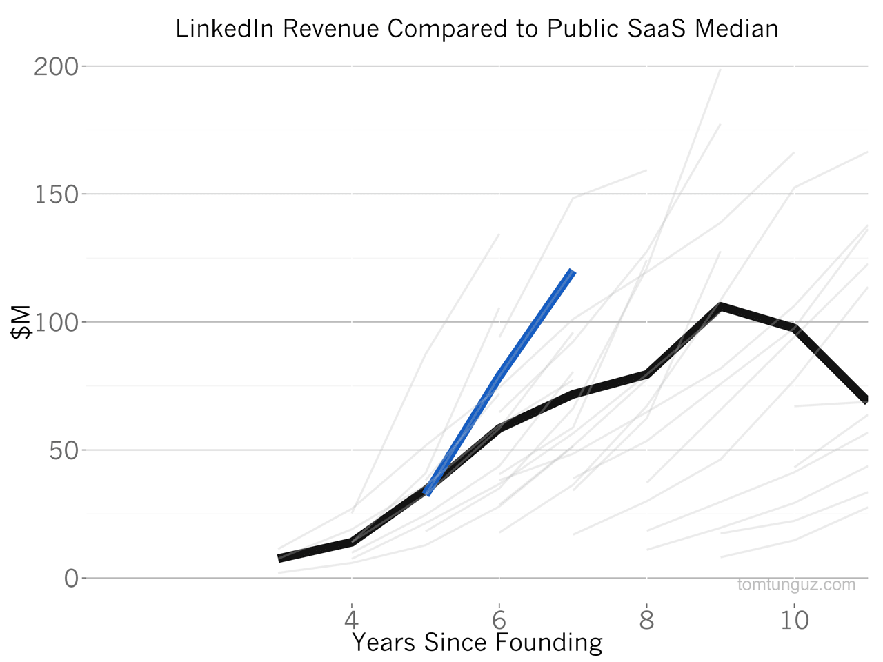
The first sales model is the 2 Phase Sell. LinkedIn and Duolingo employ this. LinkedIn attracts large number of consumers with a place to find jobs and post resumes. Then LinkedIn sells recruiters (and others) access to this data. The B2C2B sales movement involves using the consumer data to create a valuable data asset which is sold to someone else. Duolingo is a free language learning mobile application that asks language learners to translate sentences. These sentences are actually provided to Duolingo by big internet sites, who pay Duolingo to translate their pages into other languages, through the work of these language learners.